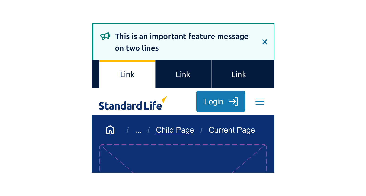
Key Points
- This element should always be displayed at the top of the viewport
- Messages should be brief and wrap to a new line on smaller viewports
- The maximum line-length is inline with our typography guidelines
- Messages should be text only, do not include links, buttons or other UI elements
- Only the definated variant styles should be used
- Banners are on the same elevation level as background surfaces, and do not require a shadow

Usage
This UI element is specifically designed to notify user of information that applies to the content below, for example
- System downtime
- Browser incompatibility
- Short announcements and updates
The banners are never sticky and should scroll off screen like other elements. The component spans the full width of the screen, but the textual content resizes. The max-width of a line should be no longer than our typography guideline.
Variants
Highlight
Used to present information to users, such as new features or key information.

Error
Used to notify users of critical information that will affect their experience.

Warning
Warns users of information that may affect their experience.

Duration
The global banner can be displayed at different durations and for several uses cases. These will determine if the element should be dismissible.
Static
When the message relates to something that has a time limit then the banner should not be dismissable. There are two possible time periods, for example
- Temporary - A banner may display a message over a specified time period
- Permanent - A banner may display a message that has no fixed time period of ending
Dismissable
If a message is not related to a time period then it can be dismissed by the user, the close button should be displayed in this instance.
In most cases, if a user opts to dismiss a message it should not be reshown. However, there may be edge cases where a message should be redisplayed.
Dismissed messages should use a transition disappear gracefully.

Global Banner Transition example (Ease out/300ms)